10 September 2026
Riviera Linen Colour Range
The Riviera Linen Colour Guide: 19 Shades for Every Table
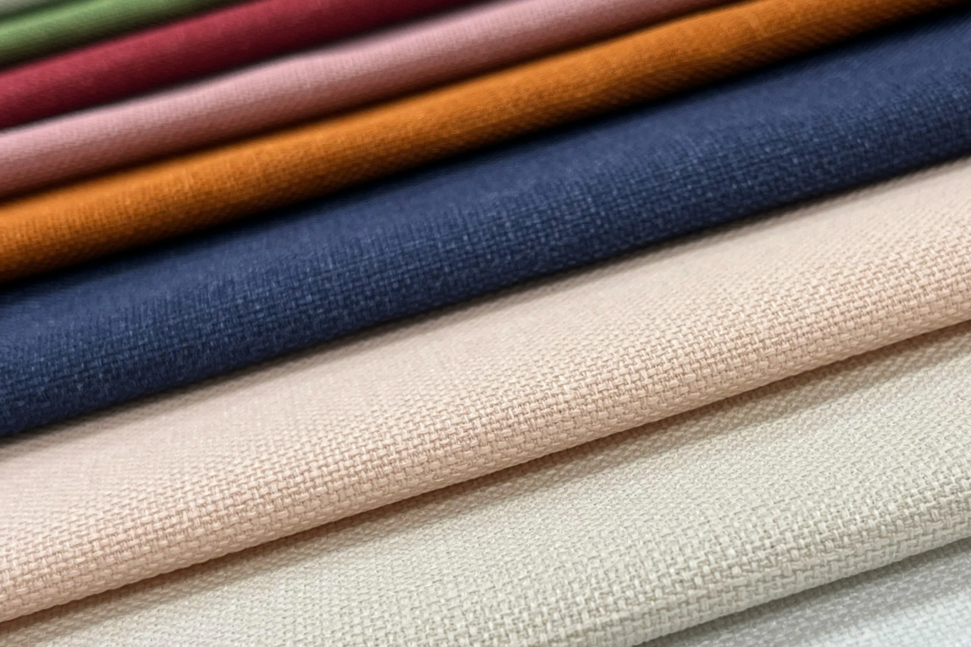
When we put the Riviera Linen collection together, we wanted a palette that could carry a wedding through every season and every scheme - from soft neutrals for a classic, understated table to rich statement tones for something bolder. The result is 19 shades, each with that same smooth handle and subtle flecked finish running through it.
To make it easier to choose (or coordinate) your napkins, tablecloths and round cloths, here's every shade in the Riviera Linen range, with a true colour swatch and a link through to the napkin so you can see it in full.
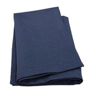
| A deep, dusky navy with a soft heathered texture, close to raw denim. Grounds a table without going full black-tie formal. |
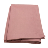
| A warm, soft blush with a hint of dusty pink. Romantic without tipping into pastel-pink cliché. |
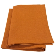
| A rich, burnt orange with terracotta undertones. Brings warmth and energy to autumn and Mediterranean-styled tables. |
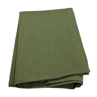
| A deep, earthy olive green. Pairs naturally with greenery, foliage and rustic or countryside settings. |
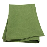
| A fresher, more vivid green with a citrus edge. Zesty and modern for spring and summer events. |
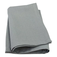
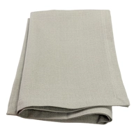
| A cool, mid-toned stone grey. Understated and versatile, sitting comfortably alongside almost any tableware. |
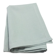
| A pale, misty blue-grey reminiscent of an overcast coastline. Soft and calming on the table. |
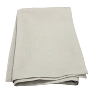
| A warmer, softer grey with a neutral, almost stone-like finish. One of the easiest shades to build a scheme around. |
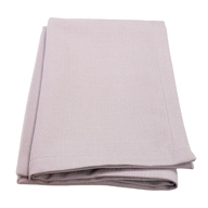
| A pale, dusty lilac rather than a true purple. Gentle and refined, good for understated florals. |
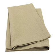
| A warm, sandy taupe. Earthy and natural, well suited to outdoor and countryside dining. |
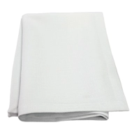
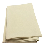
| A crisp, clean off-white. The classic neutral base for formal dining and traditional table settings. |
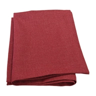
| A deep, rich wine red. A genuine statement shade for winter weddings and formal celebrations. |
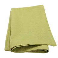
| A soft, mustard-tinged chartreuse. Unusual and characterful, pairing well with warm neutrals and brass tones. |
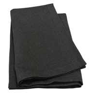
| A deep, near-black charcoal. Bold and dramatic, ideal for sleek, contemporary table designs. |
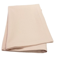
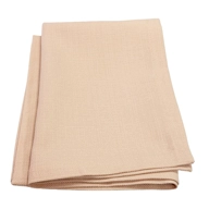
| A warm, peachy blush with apricot undertones. Soft and summery, lovely against gold or brass cutlery. |
| A pale, creamy ivory with a whisper of green. A gentle alternative to a stark white neutral. |
| A muted, warm-toned grey close to brushed metal. Quietly sophisticated and easy to style around. |
| A dusty rose-mauve with more depth than Velvet Rose. Adds a romantic but slightly moodier note. |
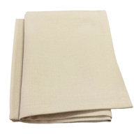
| A warm oatmeal beige. Relaxed and organic, a natural fit for rustic and countryside styling. |
Styling the palette
We find it easiest to think of the range in three groups:
Soft neutrals - Blanc de Blanc, Pearl Grey, Calico, White Asparagus, Conch Shell and Amethyst give you an understated base that works with almost any tableware or floral scheme.
Natural tones - Quarry, Sky Grey, Safari, Pewter and Denim bring a bit more depth without shouting, and pair beautifully with greenery and foliage-led decor.
Statement shades - Intense Red, Velvet Rose, Desert Sun, Pesto, Lime, Beechnut, Raven and Foxglove are where Riviera really earns its stripes, adding colour and personality to a table that wants to stand out.
Every shade is available as a napkin, and coordinates across the matching 144" x 90" and round (108" and 132") Riviera tablecloths, so you can carry a colour right across the table. If you'd like a swatch in hand before you commit, get in touch and we'll happily talk you through the range.