And the Pantone Colour of the Year for 2015 is…wait, what?
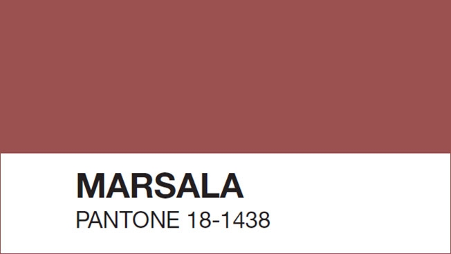
We have a winner! The Pantone Colour of the Year 2015 is Marsala; a robust and earthy shade of red, perfect for laying a foundation of elegance, within the home or at a glamorous event. But it’s a shade that has sparked debate.
The big question is: what do you think?
Every year, the colour specialists at Pantone select their Colour of the Year, based on painstaking research of global cultural and design trends and this year’s selection has caused a little controversy. Some commentators simply don’t like it.
One writer for New York Magazine’s The Cut described the colour as “icky” while another likened it to rust, or even dried blood.
This is the inherent difficulty with selecting an official colour: taste is subjective and one person’s pomegranate is another’s meatloaf.
Still, Pantone’s selection is supposedly made based on current popular trends and that means choosing Marsala as the foundation for your event guarantees that you’ll be band on trend.
Marsala, or Pantone 18-1438, is reminiscent of a full bodied red wine; in fact, the shade takes its name from a fortified wine. In design, the shade is used as a statement colour, though one that is grounded and tasteful. The satisfying richness it embodies makes it perfect for kitchens and dining rooms, through linen or accessories.
Why Marsala?
- It is equally appealing to women and men
- In fashion it encourages creativity and experimentation -- and it also works against the majority of skin tones
- In design it brings warmth and grounding. It is dramatic, whilst also natural and organic
- Marsala can convey glamour, sophistication and luxury
According to Leatrice Eiseman, Executive Director of the Pantone Colour Institute, “Marsala is a subtly seductive shade, one that draws us in to its embracing warmth”. This, of course, is going to make it extremely popular at autumn winter, but as Colour of the Year expect Pantone to crop up throughout spring and summer too.
So how will you incorporate Marsala into your event décor? Try using the shade in accent pieces within your event space. It could be table linens, napkins or table settings. Choose shades close to or contrasting with the colour Marsala for your tableware, Centrepieces tumbling with deep red dried flowers will also provide a robust visual experience.
In terms of a colour palette to work with, Pantone Officials believe it goes well with warmer taupes, and grays, and umber, golden yellow and turquoise.
Other colour experts have also said that it will work well with sandy colours and browns.